

Biyt
Biyt
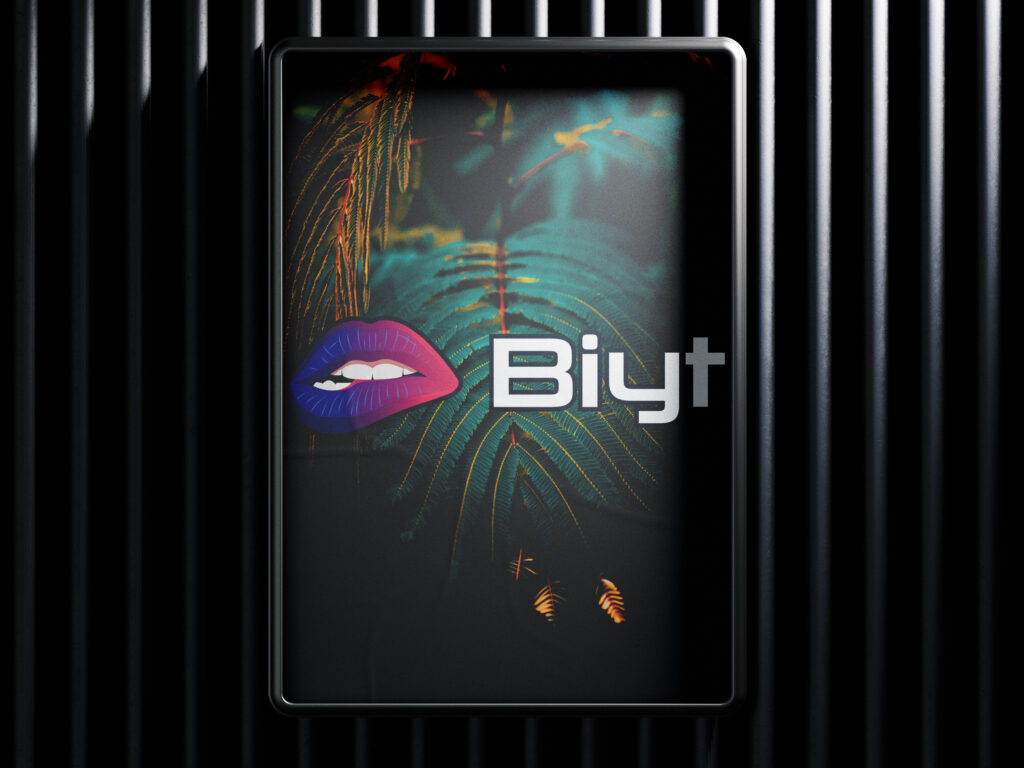
Biyt is a brand new digital creative agency, specialising in web design, SEO, marketing and social media. Biyt should come across as playful, energetic, flirty and a little bit cheeky.
It has a bright and warm colour palette, resembling a piece of pop art or an emoji.
Colour palette:
Paradise Pink: #EF476F
Rajah: #EFA55A
Yellow Crayon: #FFD166
Emerald: #3ECC66
Blue Jeans: #4AADF7
English Violet: #63476F
Gunmetal: #052C39
Graphic:
– The main graphic element is a lip bite and is the main item to be drawn. It needs to be distinct, unique and recognisable.
– I have attached a few ideas but I would like you to play around and see what you think!
– I can’t decide if the logo should be detailed with many colours, few colours, or just a single colour.
– Unicode has just announced a new lip bite emoji. Biyt will use the lip bite emoji in promotional material online once it is released, so the logo should very loosely resemble it. The logo should be a fair bit more realistic than its emoji equivalent.
– The mouth should be smiling, not pained.
– The logo should be cheeky and fun, not overly sexual.
– The emphasis should be on the lips rather than the teeth, otherwise it will look like a dentist or teeth whitening service.
– Take care not to infringe on existing lip bite/mouth logos or copyrights. These include the Rolling Stones logo and Kylie Jenner’s neon lip bite logo.
– Pink lips, rather than red. I like the idea of a distinct logo that is colour agnostic, i.e. would be recognisable printed in any colour.
Text:
– “Biyt” with uppercase ‘B’ and lowercase ‘iyt’
– The font in my sample is the Google font “Tourney”, but I would like to play around with other fonts
– Open source/royalty-free/Google fonts are ideal.
Thank you so much, I am very excited to see what you come up with. I hope to provide you with a lot of return business if this all goes well!
Many thanks,